The Project
It’s the American Dream: love, entrepreneurship and beer. Two Pittsburgh transplants from West Coast met, fell in love, got married, and decided to open their own brewery. I was delighted when they tapped me for the branding of their budding business. The owners wanted to add subtle regional flavor with the name they chose: Spoonwood, which is the Native American name for the Pennsylvania state flower, the mountain laurel. It’s a demure white bloom, shaped like a five-pointed star. A nod to the five basic steps of brewing delicious beer—mashing, boiling, fermenting, conditioning and filtering—we knew the logo needed to include the spoonwood flower.

Combining a minimalist and stylized approach to the ornamental blossom with the elegant tone the owners wanted to impart, I came up with three logo choices. But, I knew that we only needed one—when you land on the right way to go, you just know it. We immediately agreed on the logo’s type and image, and only needed to settle on the right color palette.
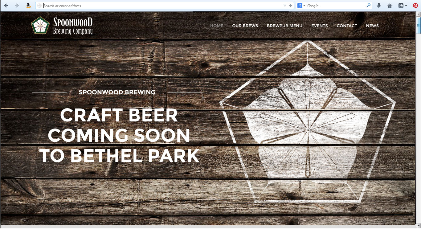
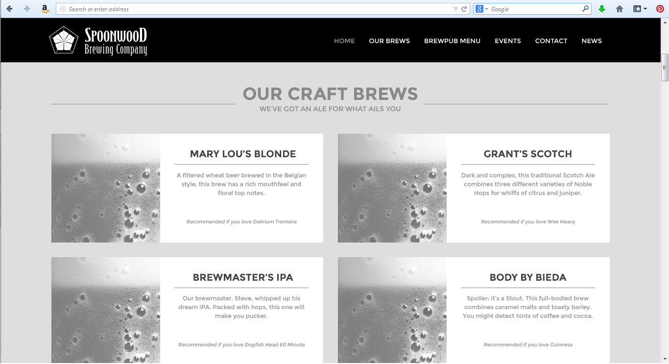
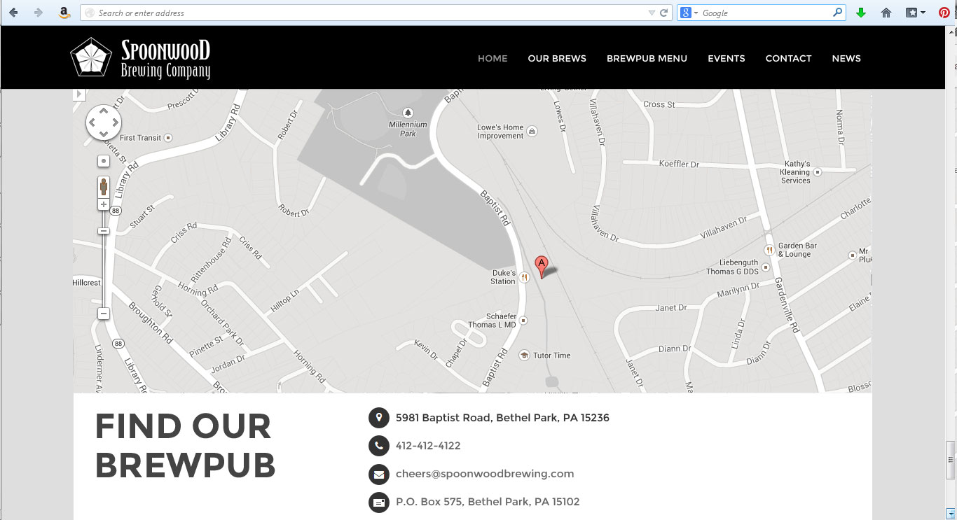
Bootstrap-ready site design mock-ups were also fun to furnish for the budding brewery. The site was designed to be used with the WordPress CMS, and it has test-driven very well within that environment. Here are a few samples, complete with beer-loving body copy, and a not-so-subtle suggestion for a stout brew named for yours truly. Would you sip a Body-by-Bieda Stout?


