Re-branding Pion Law
Quick-turnaround Logo and Website
The Project
A new law firm—Pion, Nerone, Girman, Winslow & Smith (PNGW&S) of Pittsburgh, Pennsylvania—needed a new logo and a new website, and fast.
The firm wanted to reinforce the potential appeal of being local and personal, as opposed to other firms like the Edgar Snyder group, the legal equivalent of McDonald’s, while PNGW&S might resemble an upscale bistro. So, the first to options I showed included a graphical representation of their local roots.

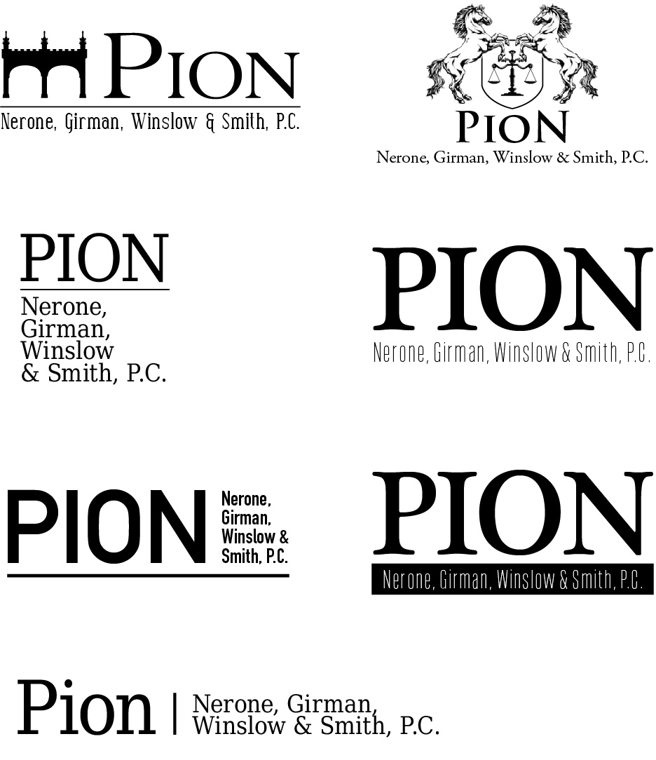
Fig. 1 – Options presented to the client for the Pion Law firm wordmark, from classic to modern, with graphic elements or purely typographic

The first, which you’ll see in the top, left corner, features my graphical representation of the Smithfield Street Bridge (fig. 2), a Pittsburgh landmark close to the PNGW&S headquarters. The second, in the top, right corner, features an homage to Pennsylvania’s state flag (fig. 3). The rest played only with typography, with a wide range of fonts and treatments in varying degrees of modernity, which I thought might be appropriate for a brand new (and recently overhauled) law firm.
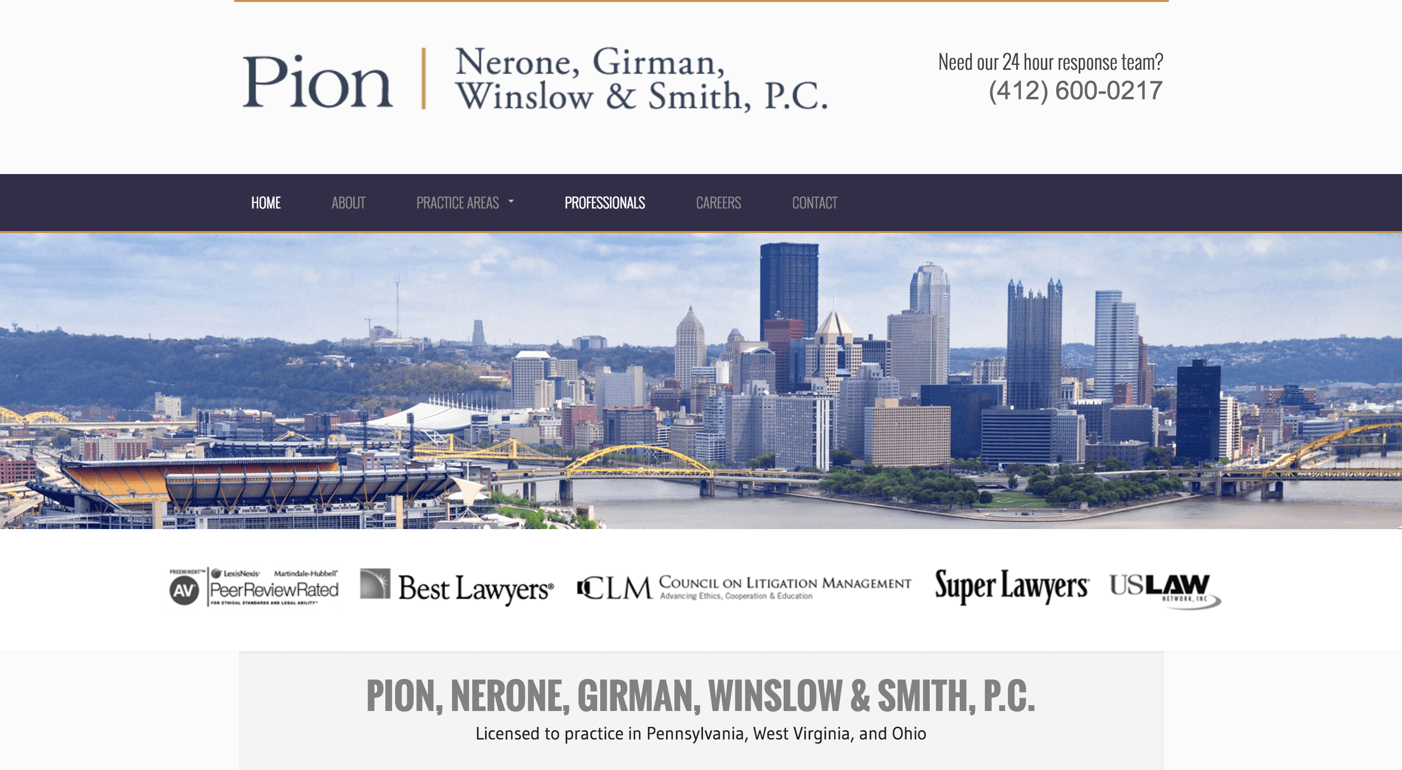
The partners ultimately opted for a more classic look and feel. After much deliberation, we finally landed upon the following word mark, which tips its hat to Pennsylvania with the blue and gold color scheme of the state flag.

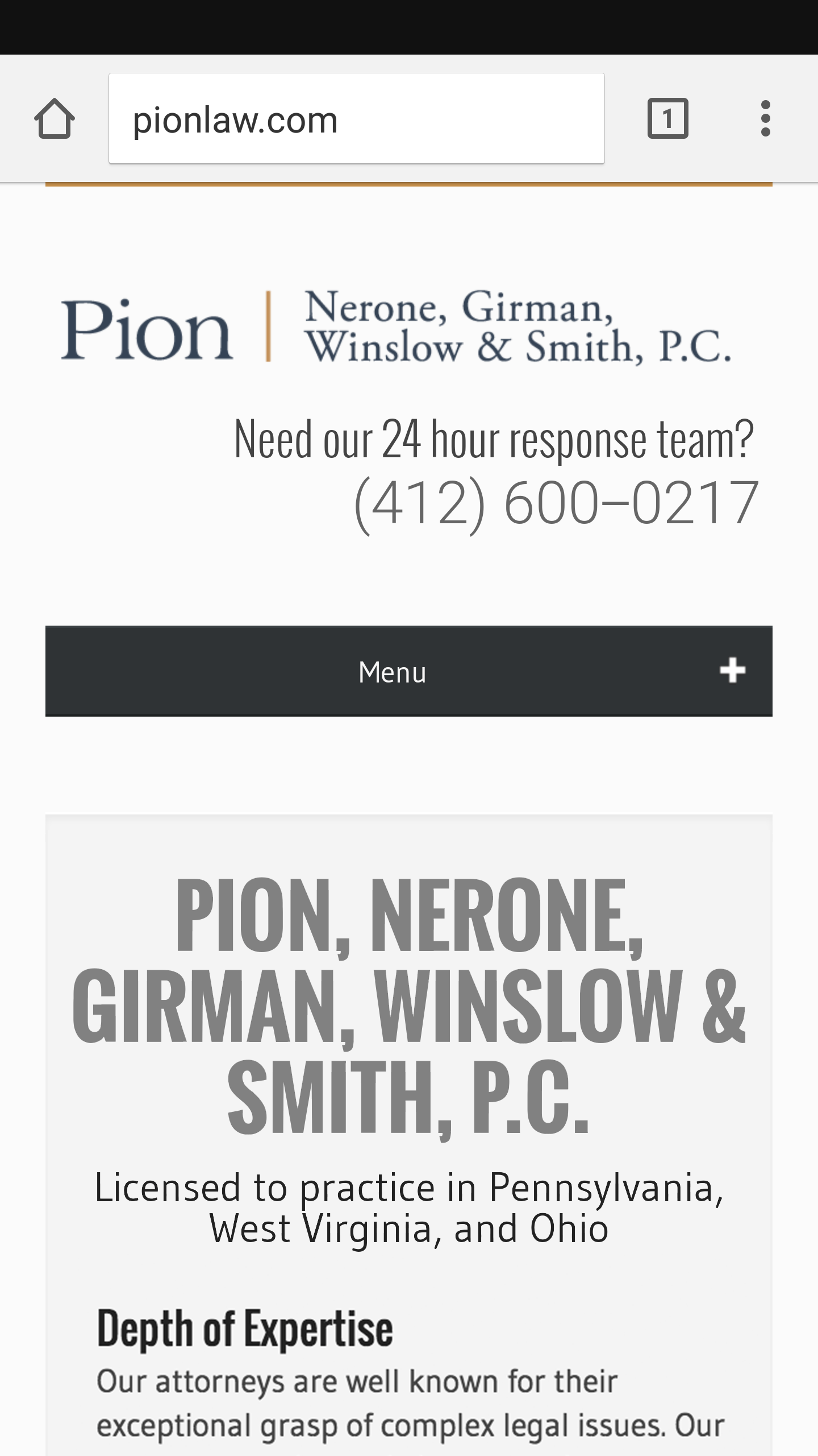
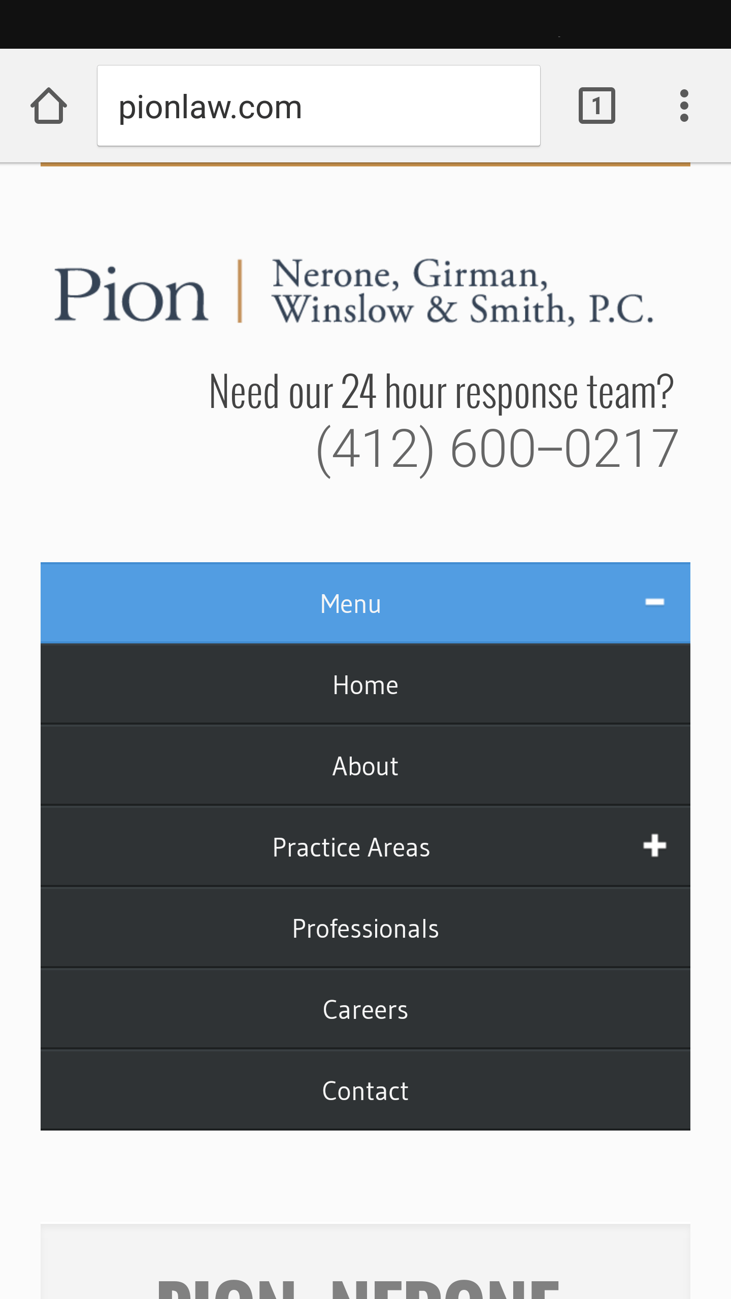
The biggest step now complete, we found ourselves in a major hurry to design and implement a brand new website. A name partner had left the firm to join another, giving Pion a narrow window in which to remove that attorney from the firm website. If too much time passes with the ex-partner still featured on the site, the firm is found to be in breach of a professional code of conduct. This is fairly simple and straightforward to accomplish, unless of course that attorney’s name is in every instance of the firm’s name and logo, and is strewn throughout the site’s body copy. The bottom line: we needed a complete website in a week. Using the popular “bootstrap” framework, I built a functional, responsive beauty within the time allotted (fig 5). Pionlaw.com is proof positive that a tight deadline is no excuse for a lousy finished product. The partners were tickled to now have a site that looked great and worked well on any device (fig. 6), that they could continue to grow with for years to come.


