Concept-driven Design for a Corporate Diversity + Inclusion Program
The Brief
- Create a campaign to inspire the intermingling of individual contributors, without illustrating a “homogenized” final product
- Pay homage to the scientific roots of the organization
- Adhere to the strict style guide defined for Thermo Scientific
The Result
“[This is] the best piece of any marketing or material this company has ever created.” —Jeff Jochims, CEO of Thermo Fisher Scientific Customer Channels Group
The Project
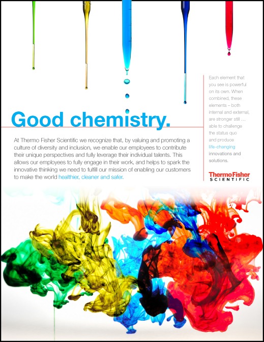
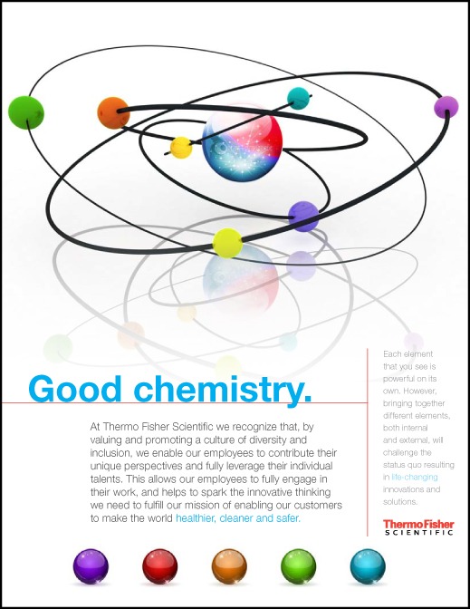
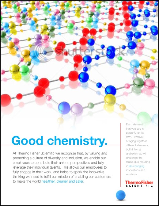
In February of 2012, the corporate Human Resources department of Thermo Fisher Scientific (hereafter: TFS) requested a meeting to kick off a new “Diversity and Inclusion” awareness campaign. Call me a cynic, but I expected to hear a whole lot of hackneyed puffery, complete with requests for stock photography of dark-skinned hands shaking light-skinned hands, and other such clichés. Instead, I was delighted to meet Alan Nevel, who had run meaningful Diversity and Inclusion campaigns for other corporate giants before his arrival at TFS. He explained that the commonly-held definition of diversity—which typically refers only to race, ethnicity or occasionally sexual orientation—deals only with superficial characteristics, and fails to open a dialog on what makes any individual a unique and valuable employee. Instead, diversity of thought is what employers must foster. At TFS, for example, single departments were populated by an incredibly diverse workforce: for example, the marketing department employed chemists, IT professionals, and laboratory technicians working right alongside peers with marketing and retail backgrounds. This rich variety of perspectives lent deeper insight into industry trends, and resulted in, arguably, more effective go-to-market strategies. In short, true Diversity and Inclusion results in groups of individuals that add up to more than the sum of their parts. After my intake meeting, I had divined a well-defined problem: create a campaign to inspire the intermingling of individual contributors, without illustrating a homogenized final product. To add to the challenge, the stakeholders wanted “science-y” overtones to pay homage to the type of work being done throughout the organization. It was a natural fit for me to turn to chemistry. In science, chemists study the behavior of a myriad elements when forced to work together under various conditions. (…subatomic corporate culture consultants?) A chemical reaction between elements is rarely what a chemist would’ve predicted based on the characteristics of each individual component — and so, I had settled on a concept that would satisfy every kind of TFS employee, from the greenest lay-person in accounting to the most hardcore biochemist on staff. I made three concept sketches: an atomic model, a molecular model, and a chemical solution. For my presentation to the board of directors, I decided that the chemical solution was THE solution: its swirling colors were striking and attractive, and told my story the most clearly to the broadest audience. However, I’ve included my preliminary sketches for you to view; I hope you’ll agree with my final decision, and also gain some visibility into my process—that I make it my business to fully understand every angle for the stakeholder and the audience.


